If you’re building (or rebuilding) a website and want it to look premium, load fast, rank well, and convert,
this guide is your roadmap. You’ll learn strategy, UX, UI, accessibility, performance, technical SEO, content,
and conversion patterns — with templates and checklists you can use immediately.
⏱️ ~0 min read🧭 Step-by-step process✅ Checklists included
Quick wins you can apply today
Clarify your primary audience + one main conversion goal.
Use a simple navigation that matches user intent.
Make speed a design feature (optimize images + fonts).
Design accessible contrast and focus states by default.
Write benefit-first copy and add a visible CTA above the fold.
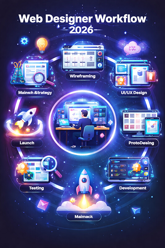
A modern workflow isn’t linear. You’ll loop through research, prototyping, content, accessibility, performance, and iteration.
Why “web design” is not just visuals anymore
Modern web design is a system. It’s your brand story, information architecture, user experience, visual identity,
content strategy, performance, accessibility, and SEO — all working together. The best-looking website can still fail
if it loads slowly, confuses users, or doesn’t answer search intent.
In this guide, you’ll build a site like a product team would: start with goals and user needs, define structure,
design components, optimize performance, and test conversion paths. The result is a website that feels premium and
drives measurable outcomes.
Key idea: Design is a promise. Your site should deliver on that promise quickly, clearly, and consistently — on every device.
1) Strategy: define what success looks like
Before wireframes, you need alignment. Strategy prevents “pretty but pointless” design and keeps stakeholders focused
on outcomes rather than opinions. Start with a clear problem statement and a measurable goal.
Define your primary goal (one per page)
Every important page should have one dominant action:
book a call,
request a quote,
buy,
subscribe, or
contact.
Secondary actions are fine — but they should never compete with the main one.
Clarify your audience and intent
Who is it for? (industry, role, maturity, budget, pain points)
Why are they here? (research, compare, solve, purchase, support)
What do they need to believe to take action?
What objections might stop them?
Decide what you will measure
Goal type
Example KPI
What “good” looks like
Lead generation
Qualified form submissions
Higher intent leads, fewer junk inquiries
Ecommerce
Conversion rate + AOV
More completed checkouts and upsells
Content / SEO
Non-branded organic clicks
More relevant visits, longer engagement
Brand
Return visitors + direct traffic
Growing awareness and trust signals
Product
Activation rate
More users reaching the “aha” moment
Pro tip: If stakeholders can’t agree on the goal, the design will become a compromise and the website will feel generic.
2) Research: build what users actually need
Research doesn’t have to be expensive. Even a few hours of structured discovery can reveal navigation labels,
content gaps, and conversion blockers.
Quick research stack
Stakeholder interviews: What’s working? What’s missing? What gets asked repeatedly?
User feedback: Ask 5–10 customers what confused them, what they expected, what mattered.
Competitor scan: Identify patterns, not inspiration. What do they explain well? What do they hide?
SEO intent mapping: Match pages to keywords + intent (informational vs commercial).
Extract “jobs to be done” from your findings
Frame needs as tasks. For example:
“As a founder, I want to see pricing expectations quickly so I can decide whether to contact you.”
“As a buyer, I want proof (reviews, case studies) so I can trust you.”
“As a visitor, I want to understand what you do in 10 seconds.”
Design shortcut: A page is “done” when it answers the visitor’s questions in a natural order — not when it looks finished.
3) Information architecture: make everything easy to find
Great information architecture (IA) feels invisible. Users don’t notice it — they just effortlessly get what they need.
Poor IA forces people to think, search, and backtrack.
Limit top-level items: Aim for 5–7 links max (plus CTA).
Group by user goals: People don’t think in internal departments.
Make “Pricing” easy: If you can’t show exact pricing, show ranges, packages, or what affects cost.
Example site map for a service business
/
├─ Services
│  ├─ Web Design
│  ├─ Ecommerce
│  ├─ SEO & Content
│  └─ Maintenance
├─ Work (Case Studies)
├─ Pricing
├─ About
└─ Contact (CTA)
Design your internal linking like a journey
Internal links are UX and SEO. Each page should naturally lead to the next best step. For example:
blog post → relevant service → case study → contact/quote.
Rule of thumb: A visitor should never feel stuck. Every page should offer a “next step” that fits their intent.
4) UX design: build clarity, confidence, and momentum
UX is the experience of getting things done. It includes structure, content order, interaction patterns, and how people feel
as they move through your website.
Above-the-fold UX checklist
One clear headline that states the outcome you create.
One supporting paragraph that explains who it’s for and why it matters.
Visual context (screenshot, product preview, or real-world photo).
Design for scanning, not reading
Most users scan. Use:
short paragraphs, meaningful headings, bullets, and
highlighted key points. Make it easy to understand the page in 30 seconds.
Micro-interactions that improve UX
Sticky CTA on long pages (mobile especially)
Inline form validation (helpful, not annoying)
Clear loading states (spinners, skeleton UI)
Friendly empty states (what to do next)
Accessible focus styles for keyboard users
5) UI design: a visual system, not a collection of screens
Modern UI design is component-driven. Instead of designing page-by-page, build a reusable system: typography, spacing,
color, buttons, cards, forms, navigation, and content modules.
Typography that feels premium
Use 2 fonts max (or 1 with multiple weights).
Define a type scale (e.g., 48/36/28/20/16/14).
Increase line-height for readability (1.6–1.8 for body text).
Keep line length around 60–90 characters.
Spacing is your secret weapon
Many “bad design” impressions are actually cramped layouts. Use consistent spacing tokens
(8px grid is common) and give content room to breathe.
Color & contrast
Your brand palette should support accessibility. Make sure text contrast passes WCAG guidelines,
and don’t rely on color alone to communicate status (use icons + text).
UI shortcut: If your spacing and typography are strong, your design will look professional even with minimal decoration.
6) Accessibility: design for everyone (and reduce legal risk)
Accessibility isn’t optional — it improves usability for all users and often boosts conversion.
Build accessibility into your components and QA process from day one.
Non-negotiables
Keyboard navigation: Can you reach everything with Tab + Enter?
Focus states: Visible focus rings for interactive elements.
Alt text: Meaningful image descriptions (not “image1”).
Form labels: Real labels, not only placeholders.
Contrast: Text must be readable in all contexts.
Accessible content patterns
Write descriptive link text (“View ecommerce case studies”) instead of “Click here”.
Use headings in order (H2 → H3 → H4) to help screen readers.
Provide captions/transcripts for media when possible.
7) Performance: speed is part of design
Performance impacts everything: user satisfaction, conversion rate, SEO, and ad efficiency.
Treat performance as a design requirement — not an afterthought.
Biggest wins (usually)
Images: compress, resize, and lazy-load below the fold.
Fonts: use modern formats, limit weights, preconnect, and avoid blocking loads.
CSS: remove unused rules and avoid heavy animations.
Hosting: use caching, CDN, HTTP/2 or HTTP/3.
Practical image optimization example
<img
  src="hero-1200.webp"
  srcset="hero-640.webp 640w, hero-1200.webp 1200w, hero-1800.webp 1800w"
  sizes="(max-width: 768px) 92vw, 1100px"
  width="1200"
  height="675"
  loading="lazy"
  decoding="async"
  alt="Website homepage hero showing value proposition and call to action">
UX truth: Users interpret slow loading as lack of quality — even if the design is beautiful.
8) SEO-driven design: structure, intent, and internal links
SEO is not “keywords sprinkled on a page.” It’s a system of pages that answer real queries better than alternatives,
in a structure that search engines can understand.
On-page SEO essentials (design + content)
One H1 per page aligned to a primary keyword topic.
Clear H2/H3 structure that matches the user’s questions.
Schema where relevant (FAQ, Article, Product, LocalBusiness).
Performance + mobile usability (affects rankings and user signals).
Search intent mapping example
Query type
Intent
Best page type
Conversion path
“web design agency near me”
Commercial
Service + location page
Call / quote
“how much does a website cost”
Commercial research
Pricing guide
Packages → contact
“best website layout for services”
Informational
Blog post
Related service CTA
“ecommerce design examples”
Inspiration + compare
Case studies / gallery
Consultation
Write like a helpful expert, not a brochure
The best SEO content is useful, specific, and structured. Add examples, steps, and decision-making frameworks.
The more your page helps users finish their “job,” the more it earns trust and engagement.
9) Content strategy: say the right things in the right order
Content is the engine of understanding. You can have great UI, but if your copy is vague, visitors won’t convert.
Great web copy reduces uncertainty and makes the next step feel safe.
High-converting homepage structure
Value proposition: what you do and who it’s for.
Proof: results, reviews, logos, metrics.
Services / product overview: what you offer.
How it works: steps, timeline, expectations.
Case studies: before/after, outcomes.
FAQ: handle objections.
CTA: clear next step.
Copywriting framework you can reuse
Problem: what’s broken or frustrating?
Impact: why does it matter?
Solution: what do you do differently?
Proof: what evidence supports your claims?
Next step: what should the user do now?
Conversion tip: Replace “We offer…” with “You get…” and “So you can…” to make benefits explicit.
10) Component-driven design: build faster and stay consistent
Component-driven design is how modern teams ship quality at scale. You design reusable blocks and assemble pages like LEGO.
This reduces inconsistencies, speeds up development, and makes iterations safer.
Core component library (starter list)
Buttons (primary, secondary, text), button groups
Forms (inputs, textareas, selects, validation states)
Cards (feature, testimonial, case study)
Navigation (header, mobile menu, breadcrumbs)
Hero blocks, feature grids, pricing tables
FAQ accordion, timelines, stats counters
Design tokens (the consistency layer)
Tokens are your system variables: colors, spacing, radii, typography sizes, shadows. They make your UI cohesive and easier to maintain.
Conversion is not “tricks.” It’s removing friction and increasing confidence. A user converts when the perceived value
is high and the perceived risk is low.
Trust signals that actually work
Specific outcomes: “+38% leads in 60 days” beats “great results”.
Real testimonials: include role, company, and context.
Case studies: show the process + outcome.
Transparent expectations: timeline, deliverables, what you need from the client.
Guarantees / risk reversal: where appropriate and honest.
CTA principles
Be explicit: “Request a quote” / “Book a call” / “Get pricing”.
Reduce commitment: “Get a free assessment” can work better than “Buy now” for services.
Repeat the CTA after major sections on long pages.
Use a strong button label that describes the outcome.
Conversion mantra: Make the next step obvious, easy, and emotionally safe.
12) QA & launch: ship confidently
Launch is not a single moment — it’s a controlled release. QA protects your brand and prevents embarrassing issues
like broken forms, missing meta tags, or unreadable mobile layouts.
Pre-launch checklist
All pages have unique titles and meta descriptions.
Forms work and deliver emails to the right inbox.
Mobile menus work and are keyboard accessible.
Images are optimized and lazy-loaded where appropriate.
Analytics installed (without slowing the site).
404 page exists and guides users back.
Sitemap and robots rules are correct.
Core pages load fast on mobile data.
Post-launch: iterate with data
After launch, track:
conversions, scroll depth, top exits, form drop-offs, and pages that attract organic visits. Improve content, clarify CTAs,
and refine navigation based on behavior — not guesses.
Templates you can copy-paste
Homepage headline formula
[Outcome] for [Audience] without [Pain].
Example: “High-converting websites for local businesses without tech overwhelm.”
Service page structure
H1: Service name + primary benefit
- Who it’s for
- What you get (deliverables)
- How it works (steps)
- Proof (case study + testimonials)
- Pricing expectations
- FAQ
- CTA
Case study structure
- Client + context
- Challenge
- Strategy
- Design + build approach
- Results (numbers + screenshots)
- What we learned
- CTA to start a similar project
Want a website that looks premium and converts?
If you want a professional website built with modern UX/UI, performance, and SEO in mind,
start here: https://webdesigner.bg.
Tip: Bring a short list of examples you like + your main goal (leads, sales, bookings). You’ll get better recommendations faster.
FAQ: Ultimate Web Design Guide
How long does a website design take?
It depends on scope and readiness. A focused marketing website can be shipped quickly when goals, content, and decisions are clear.
Bigger sites (multi-language, ecommerce, custom integrations) naturally take longer due to content, QA, and complexity.
What matters more: design or SEO?
They’re connected. SEO brings qualified visitors; design helps them understand, trust, and convert. The best approach is to design pages
around search intent and user tasks while keeping performance and accessibility strong.
What should I prioritize if my budget is limited?
Prioritize clarity, a clean structure, fast performance, strong copy, and a single conversion path. You can add advanced animations and
extra pages later — but your core pages must be excellent from day one.